Fibre Council Europe
All casesFibre Council Europe — Evolving a recognised identity into a connected European brand ecosystem.
THE CONTEXT
Giving a European industry organisation a stronger identity for the future
Fibre Council Europe plays a central role within Europe’s fibre ecosystem, bringing together industry, infrastructure, policy and digital development around the ambition of advancing fibre connectivity across the continent. The organisation needed to evolve its existing identity while preserving the recognition and visual equity built over time. The objective was not to create a rupture, but to make the brand more contemporary, flexible and distinctive across institutional, digital and communication environments.
THE CHALLENGE
Modernising the brand while preserving continuity
The existing identity already carried strong recognition within the sector. The challenge was therefore to move it forward while retaining the visual elements that made it identifiable. At the same time, the system needed to work across very different contexts: policy and institutional communication, reports, presentations, websites and a major international conference. The rebrand had to combine credibility and authority with a more contemporary expression of connectivity, movement and digital progress.
OUR RESPONSE
Building one visual system with two complementary expressions
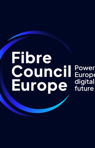
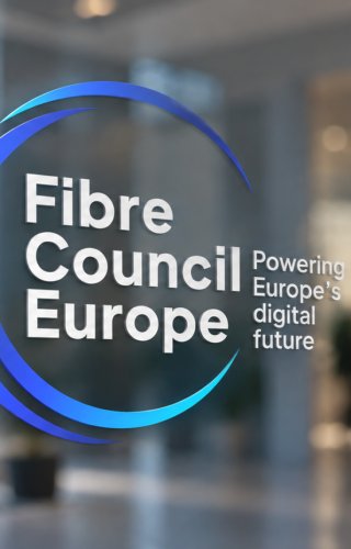
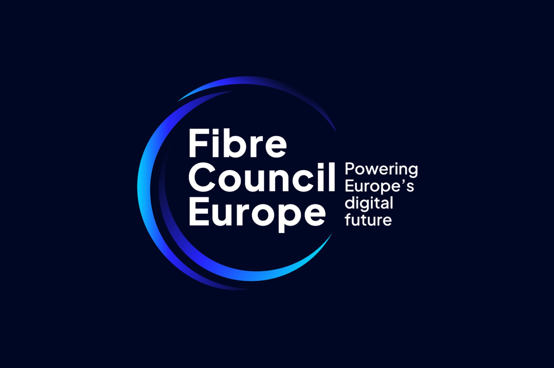
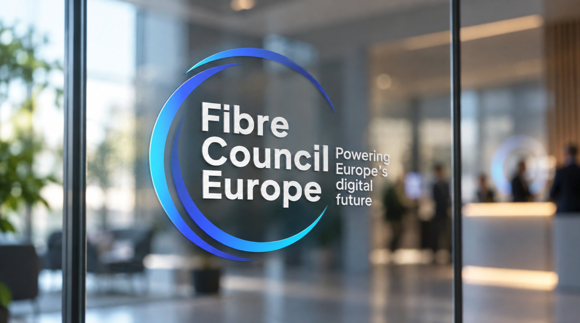
We developed the new Fibre Council Europe identity as an evolution of the existing brand, preserving its core DNA while simplifying and strengthening its expression. The three arches of the symbol were retained and reinterpreted as a more balanced and dynamic representation of fibre networks, stakeholder convergence and forward movement. From this foundation, we created a broader system capable of supporting both the institutional Council identity and the more expressive Fibre Horizons conference brand.
BRAND IDENTITY
Creating clarity, movement and recognition
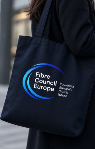
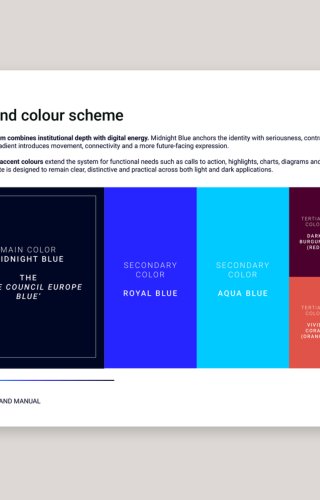
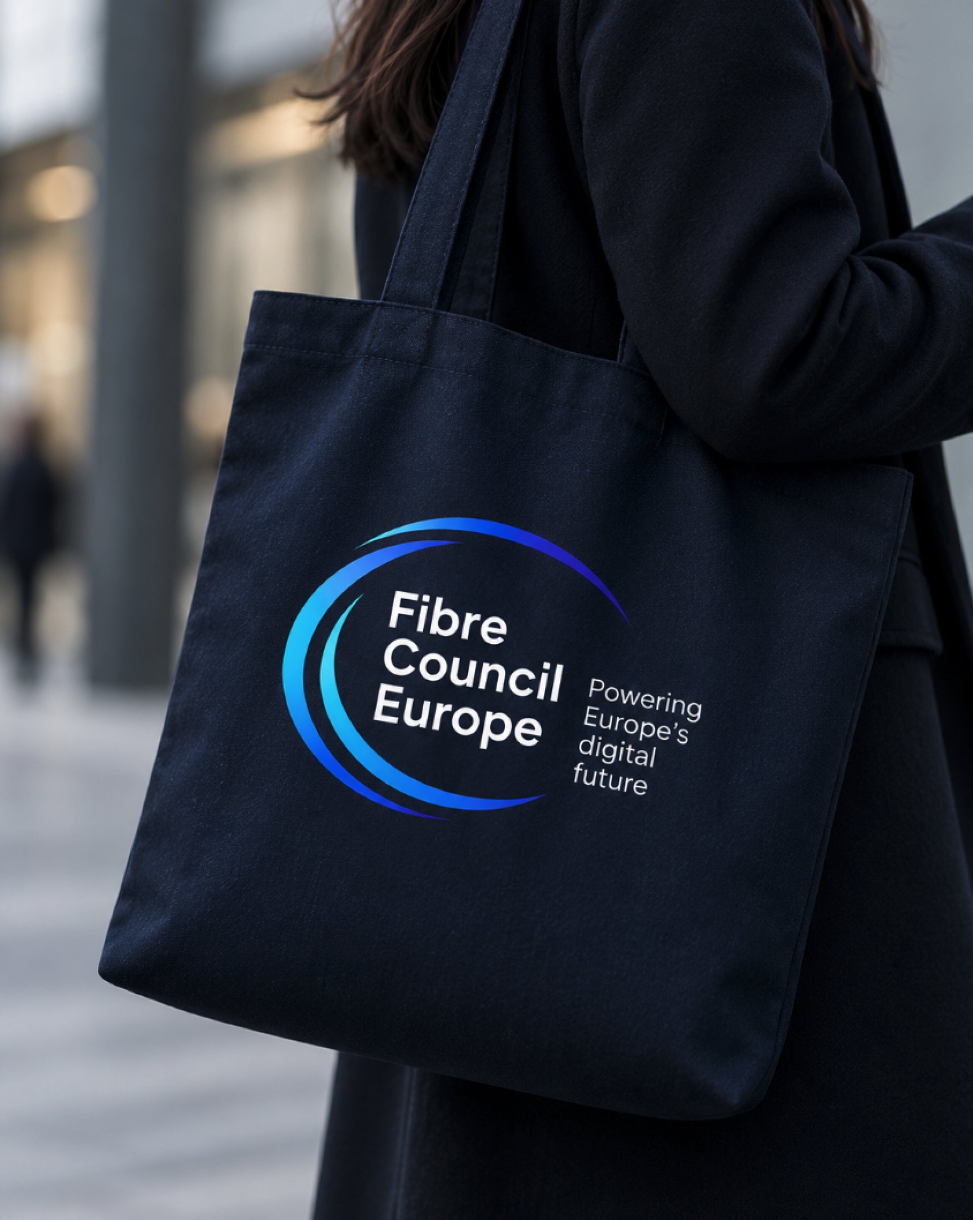
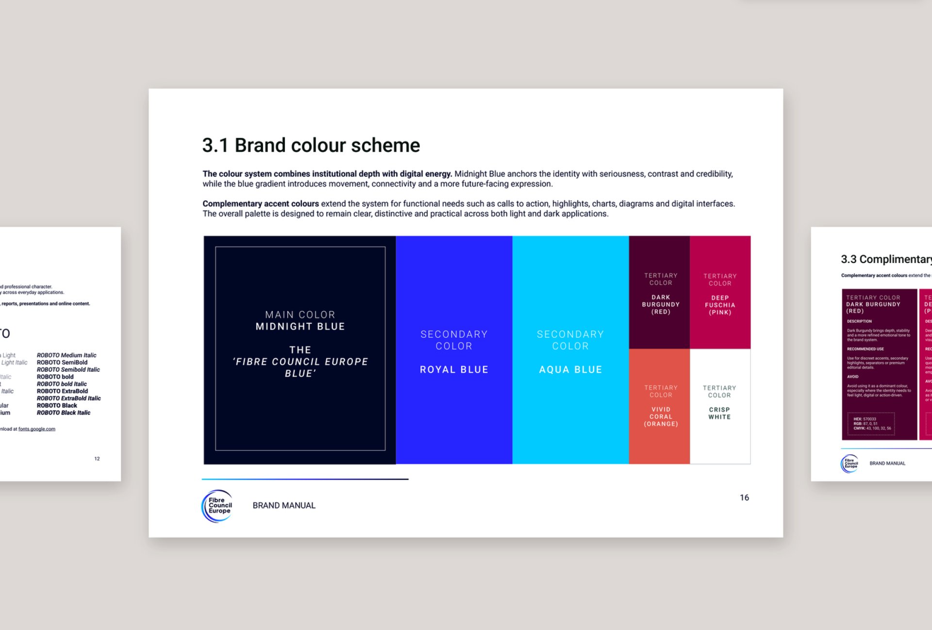
The new logo combines a stable wordmark with three dynamic arches inspired by the fibre strands of the previous identity. The visual system is anchored in Midnight Blue, Royal Blue and Aqua Blue, creating a controlled gradient that moves from institutional depth towards digital energy and connectivity. Typography, colour, imagery, iconography and layout principles extend this logic into a flexible system designed to remain recognisable across both digital and physical touchpoints.
FIBRE HORIZONS
Extending the parent brand into a more expressive event identity
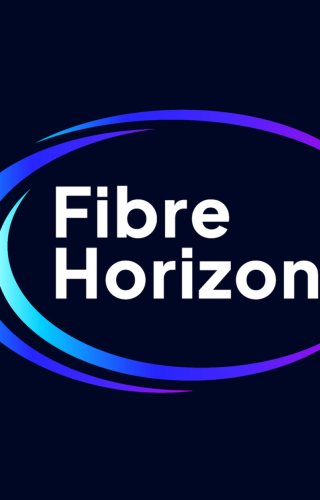
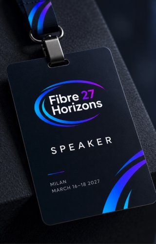
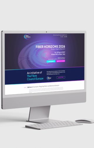
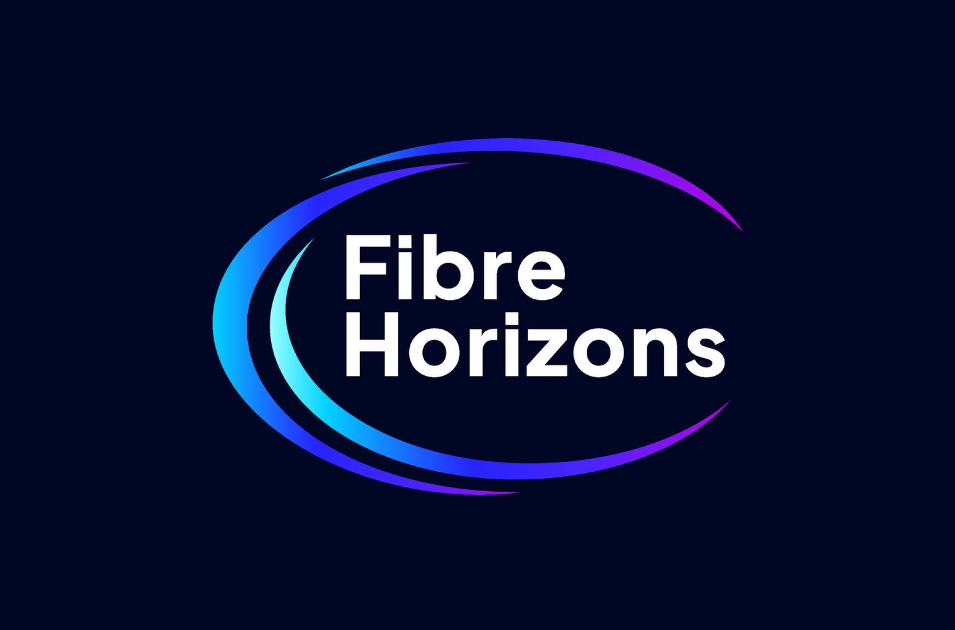
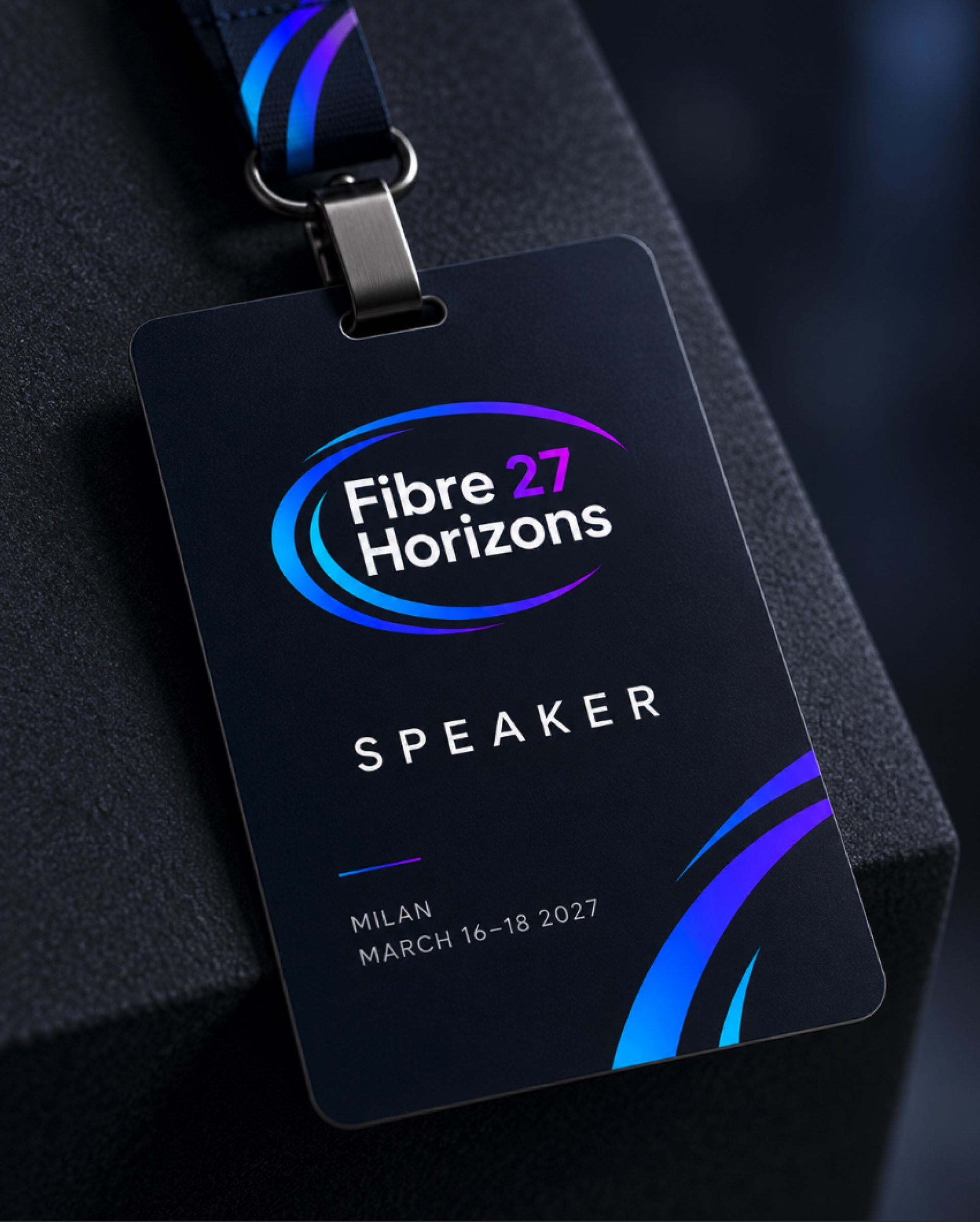
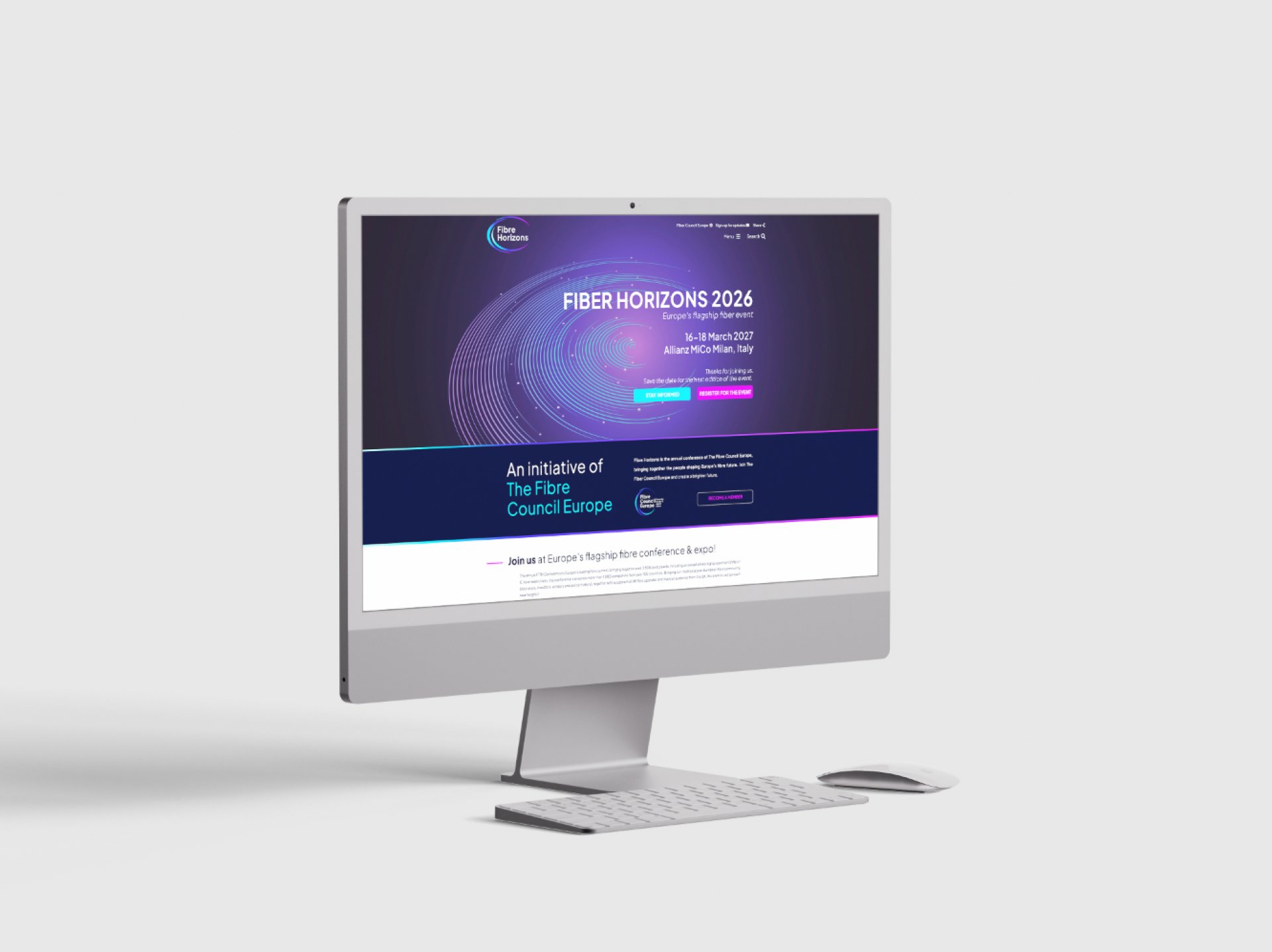
The annual conference was given its own identity under Fibre Horizons, conceived as a natural extension of Fibre Council Europe. The same three-arch principle is stretched into a more elliptical form, creating greater movement and giving the event a distinctive personality while maintaining a clear connection with the parent brand. A broader palette introduces cyan, purple and fuchsia tones, allowing Fibre Horizons to express the energy, innovation and atmosphere expected from Europe’s flagship fibre event.
DIGITAL EXPERIENCE
Bringing the new identities to life online
The visual system was extended into the digital environments of Fibre Council Europe and Fibre Horizons. The Council website adopts the more institutional side of the identity, with strong hierarchy, clear information and a controlled use of colour and imagery. Fibre Horizons develops the same foundations into a more immersive and event-driven experience. Together, both platforms create a coherent digital relationship between the organisation and its flagship event while giving each one its own tone and purpose.
BRAND SYSTEM
Creating consistency beyond the logo
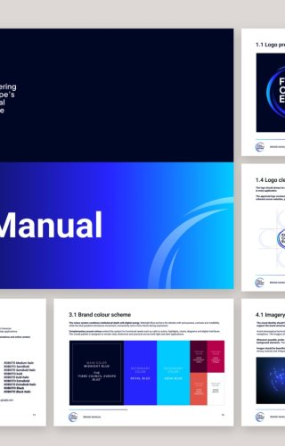
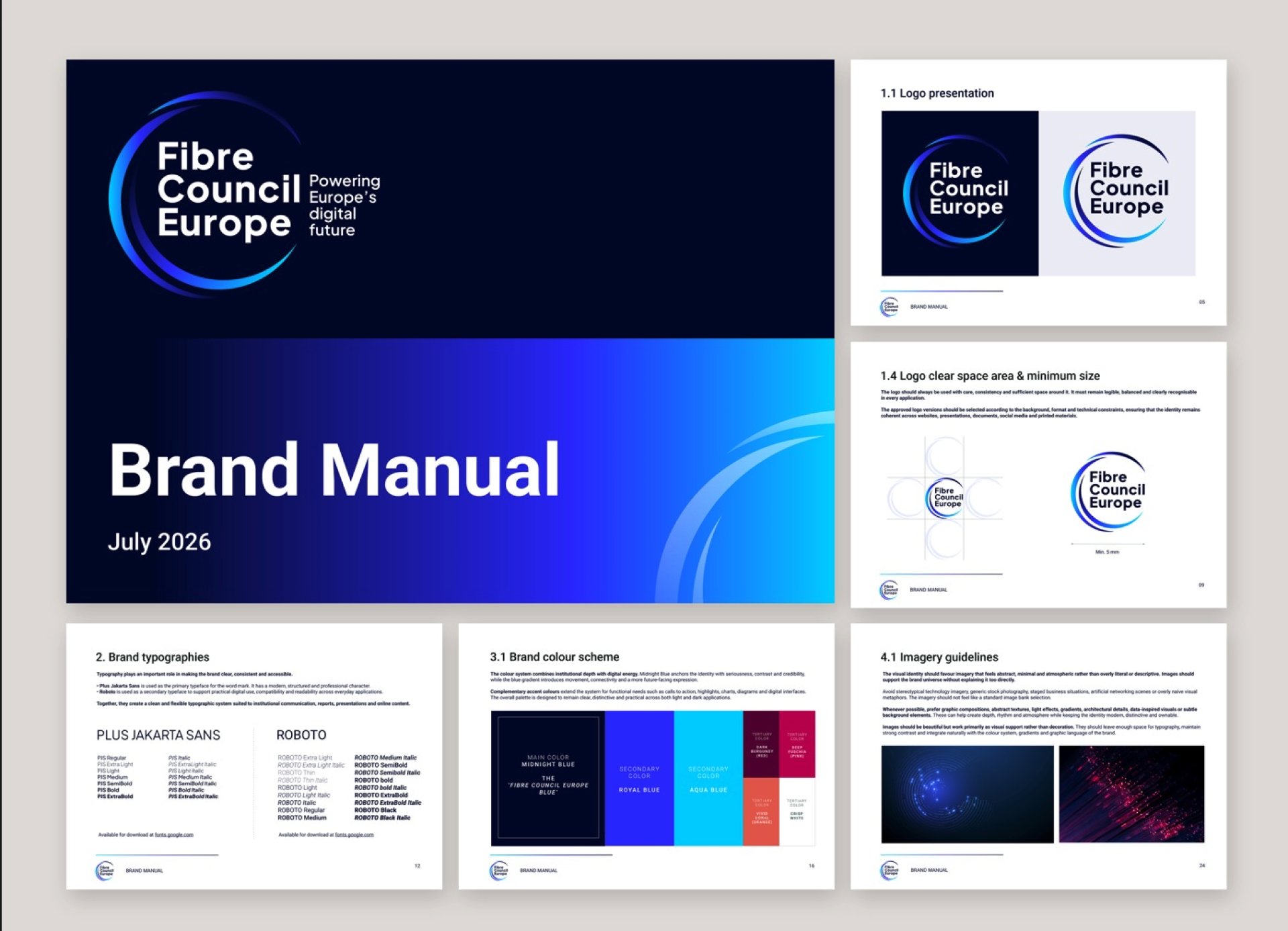
The project was developed as a complete identity system rather than a logo redesign. Detailed brand guidelines define logo use, typography, colour palettes, gradients, imagery, iconography and layout principles, creating a practical framework for internal teams and external partners. This gives both identities the flexibility to evolve across websites, presentations, reports, digital content, event communications and physical environments while maintaining a clear family resemblance.
THE RESULT
Two identities, one connected brand ecosystem
Fibre Council Europe now has a clearer and more contemporary identity that preserves its heritage while giving the organisation a stronger platform for the future. Fibre Horizons extends that same DNA into a more dynamic and expressive territory designed for the conference experience. Together, the two brands create a coherent ecosystem in which institutional credibility and event energy reinforce the same ambition: powering Europe’s digital future.
SCOPE
Brand strategy, Rebranding, Visual identity, Logo design, Brand architecture, Digital identity, UX/UI Design, Website redesign, Event identity, Brand guidelines, Visual system.