FFA
All casesFFA — Giving francophone amateur football a new identity.
THE CONTEXT
A new chapter for a recognised football organisation
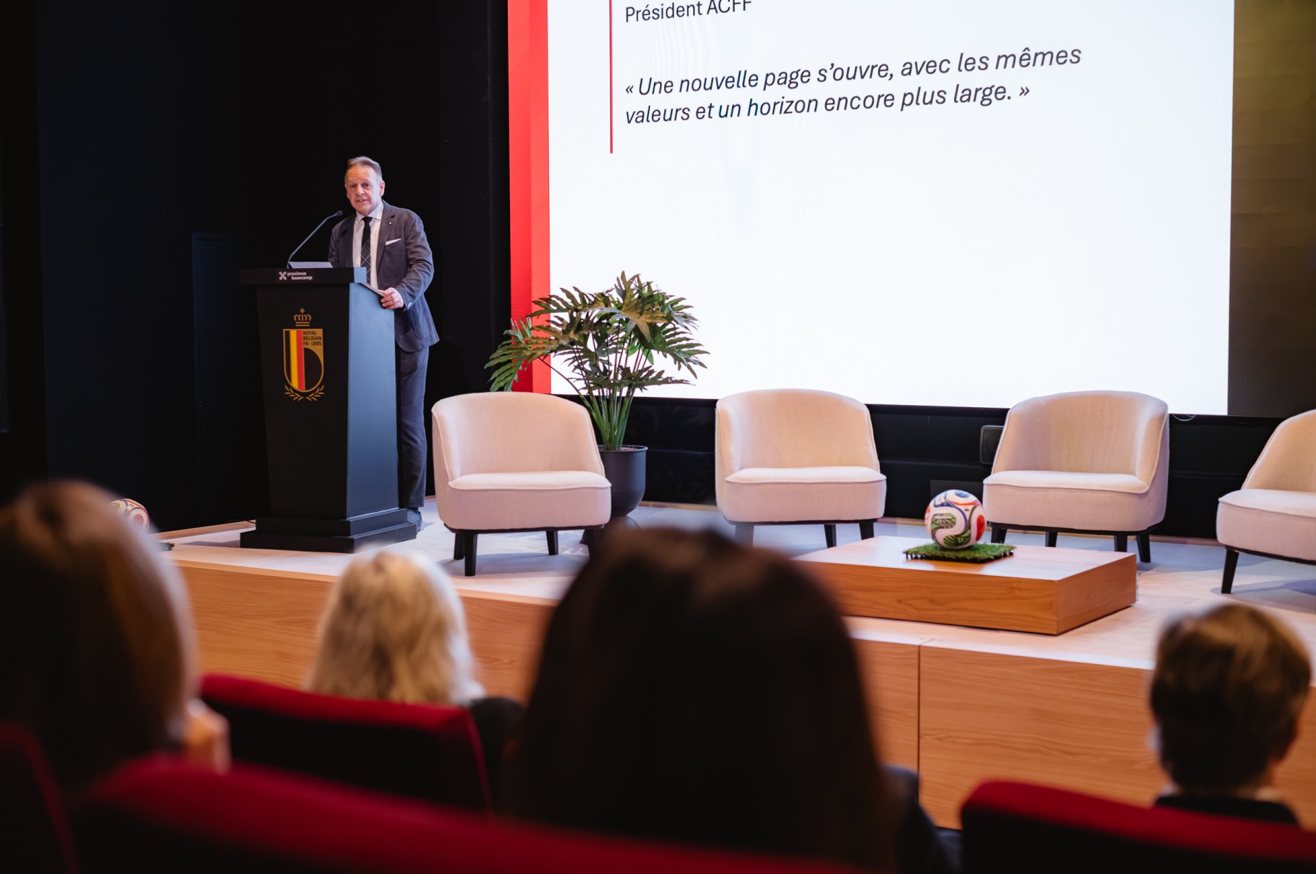
The Association des Clubs Francophones de Football was entering a new phase in its development.
The transition from ACFF to FFA — Football Francophone Amateur — required more than a new acronym. The organisation needed a name and identity capable of creating a clearer and more immediate expression of who it represents.
Creativeroom was entrusted with developing the new brand, from naming and visual identity to the guidelines required for its deployment.
THE CHALLENGE
Creating change while preserving recognition
The new identity needed to mark a clear evolution while remaining credible and accessible to an established football community.
The challenge was to build a brand that could work across institutional communication, clubs, digital platforms and everyday applications while giving FFA a stronger and more contemporary presence.
The transition therefore had to feel both significant and natural.
OUR RESPONSE
Building a simpler and stronger brand
We developed FFA as a more direct and memorable expression of the organisation.
The new name simplifies recognition, while the visual identity introduces a distinctive symbol and a stronger graphic language designed to work consistently across communication formats.
Naming, logo, colours, typography and applications were developed as one system, creating a clear foundation for the new brand.
NAMING
From ACFF to FFA
The move to FFA — Football Francophone Amateur — brings the organisation’s field of action directly into the name.
Shorter and more immediate, FFA creates a stronger verbal identity and provides a more flexible signature for communication.
The name becomes the starting point for a brand designed to be recognised quickly and used consistently across different contexts.
VISUAL IDENTITY
Creating a distinctive football signature
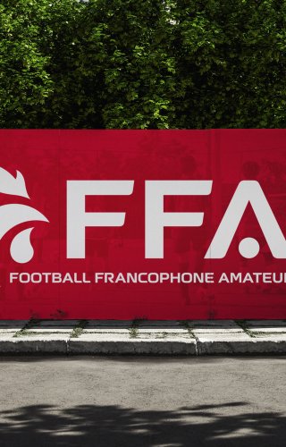
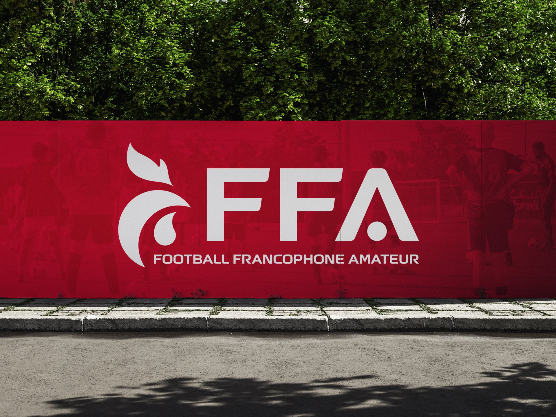
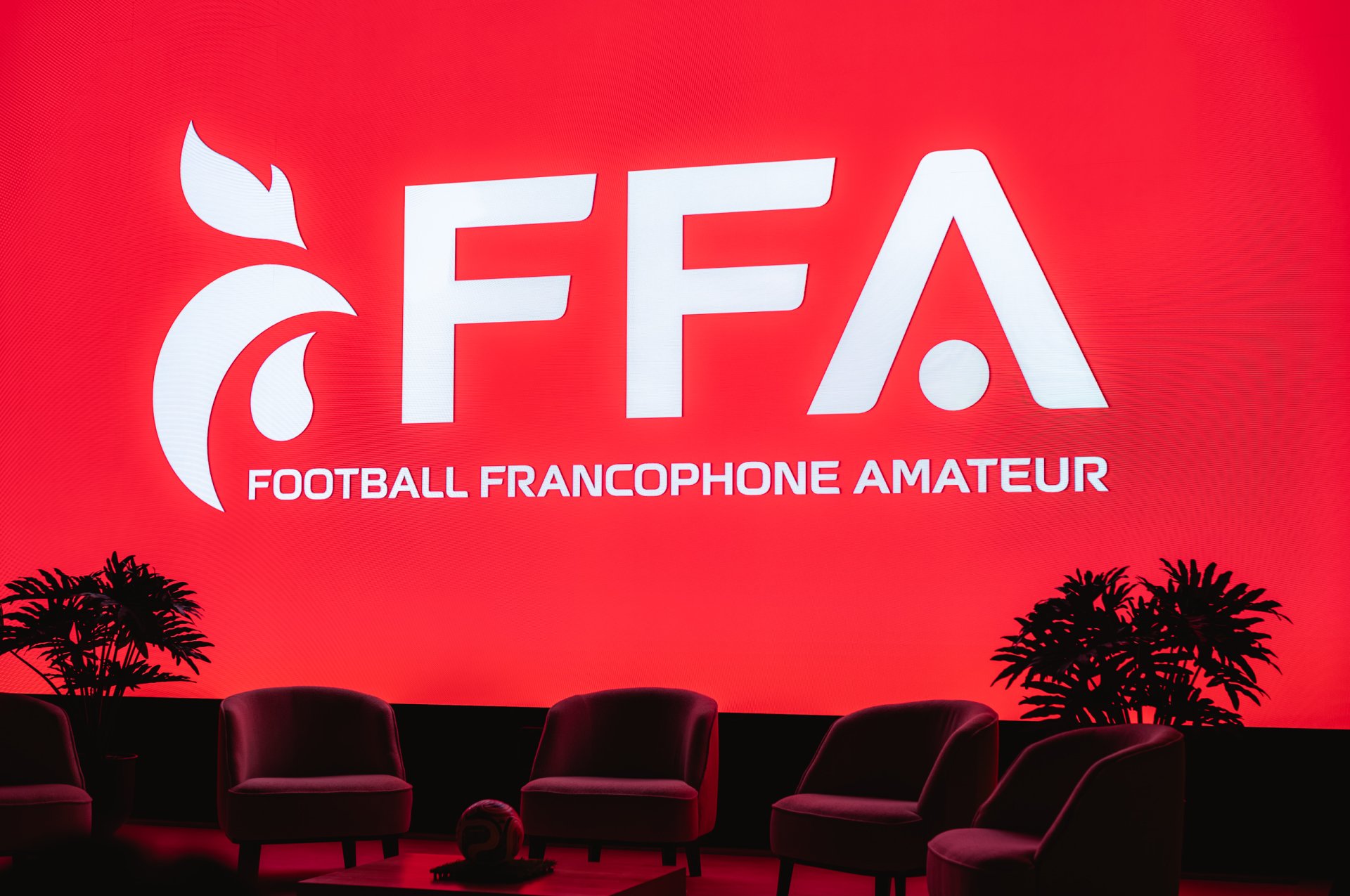
The new identity combines a bold typographic expression with a distinctive emblem inspired by the world of football and the organisation’s francophone identity.
The red palette gives the brand strong visibility, while the graphic system provides enough flexibility for institutional, digital and promotional applications.
The result is a visual identity that feels more contemporary, direct and immediately recognisable.
BRAND SYSTEM
Making the identity work everywhere
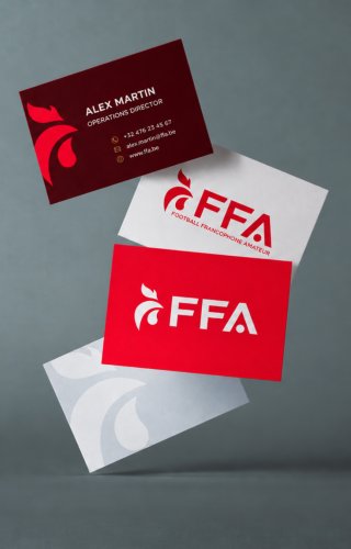
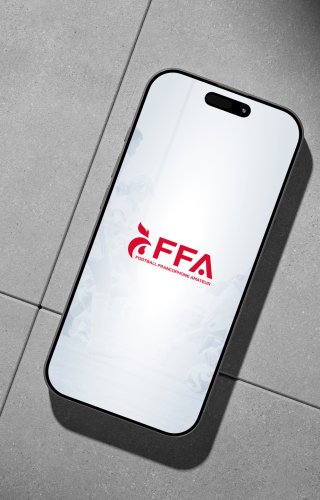
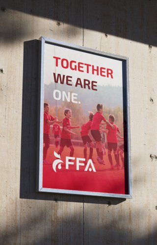
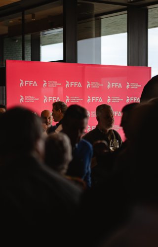
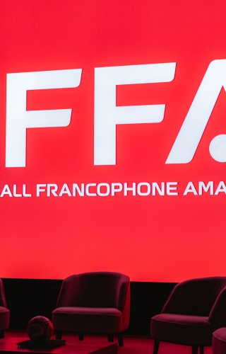
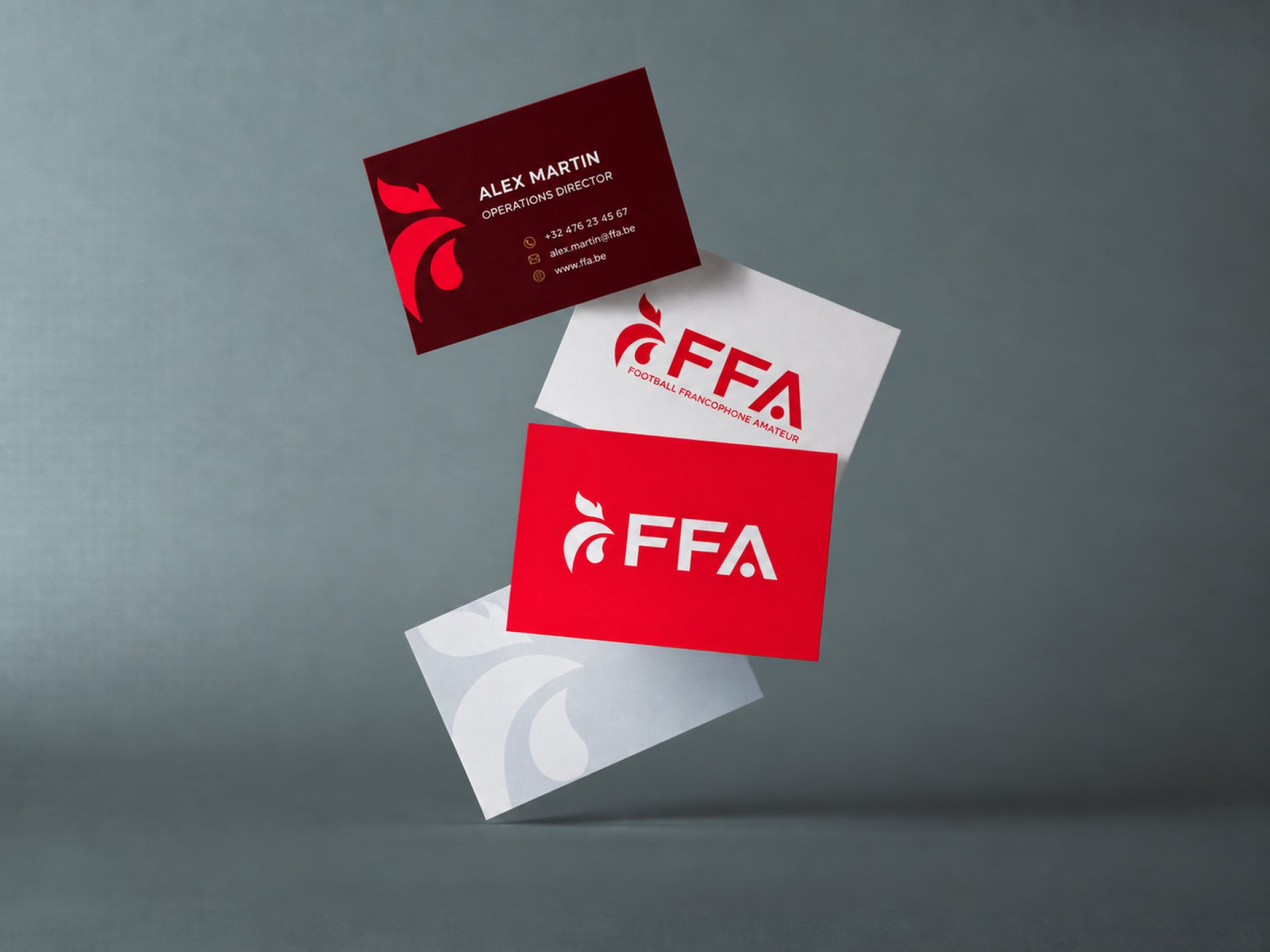
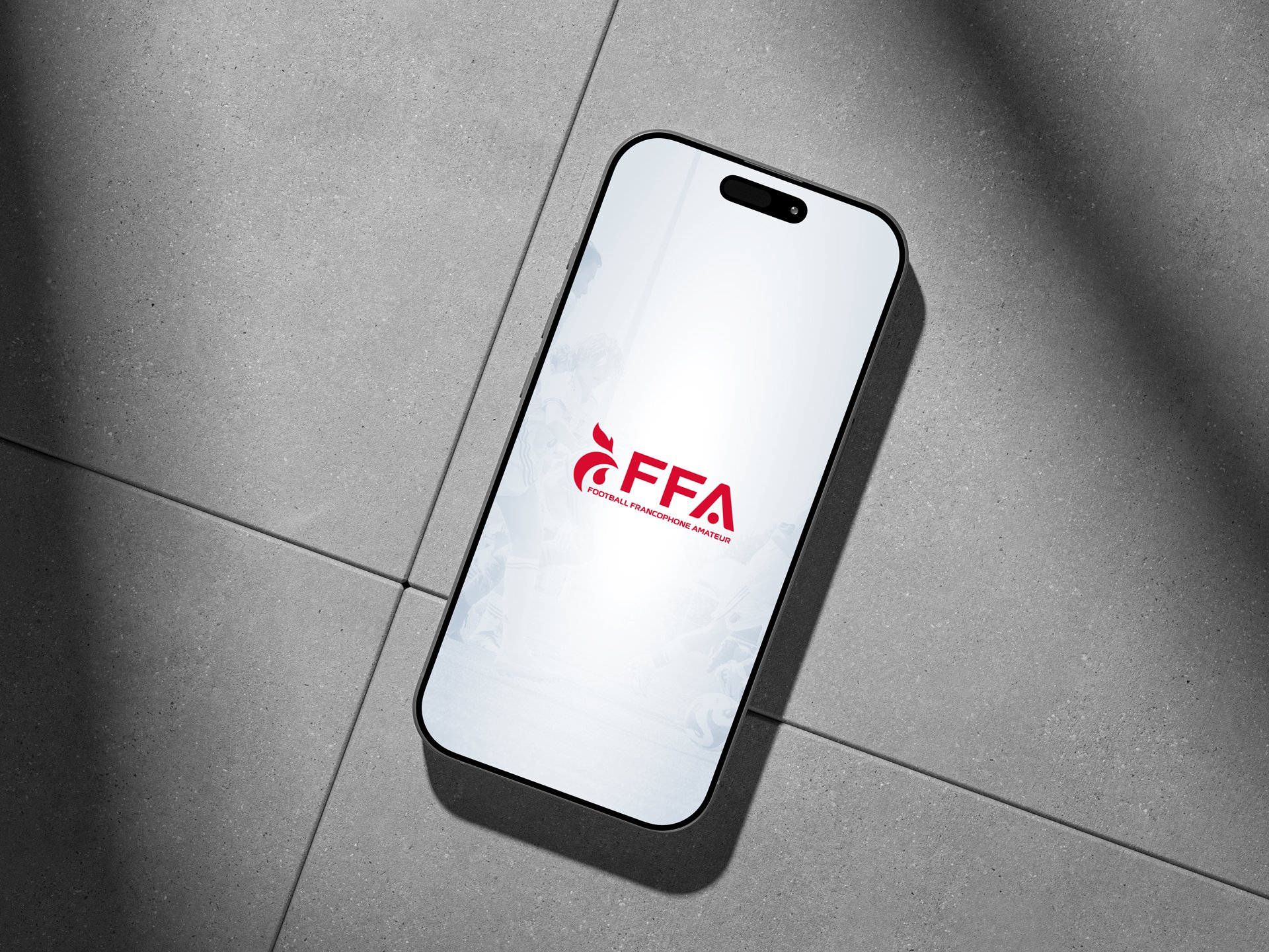
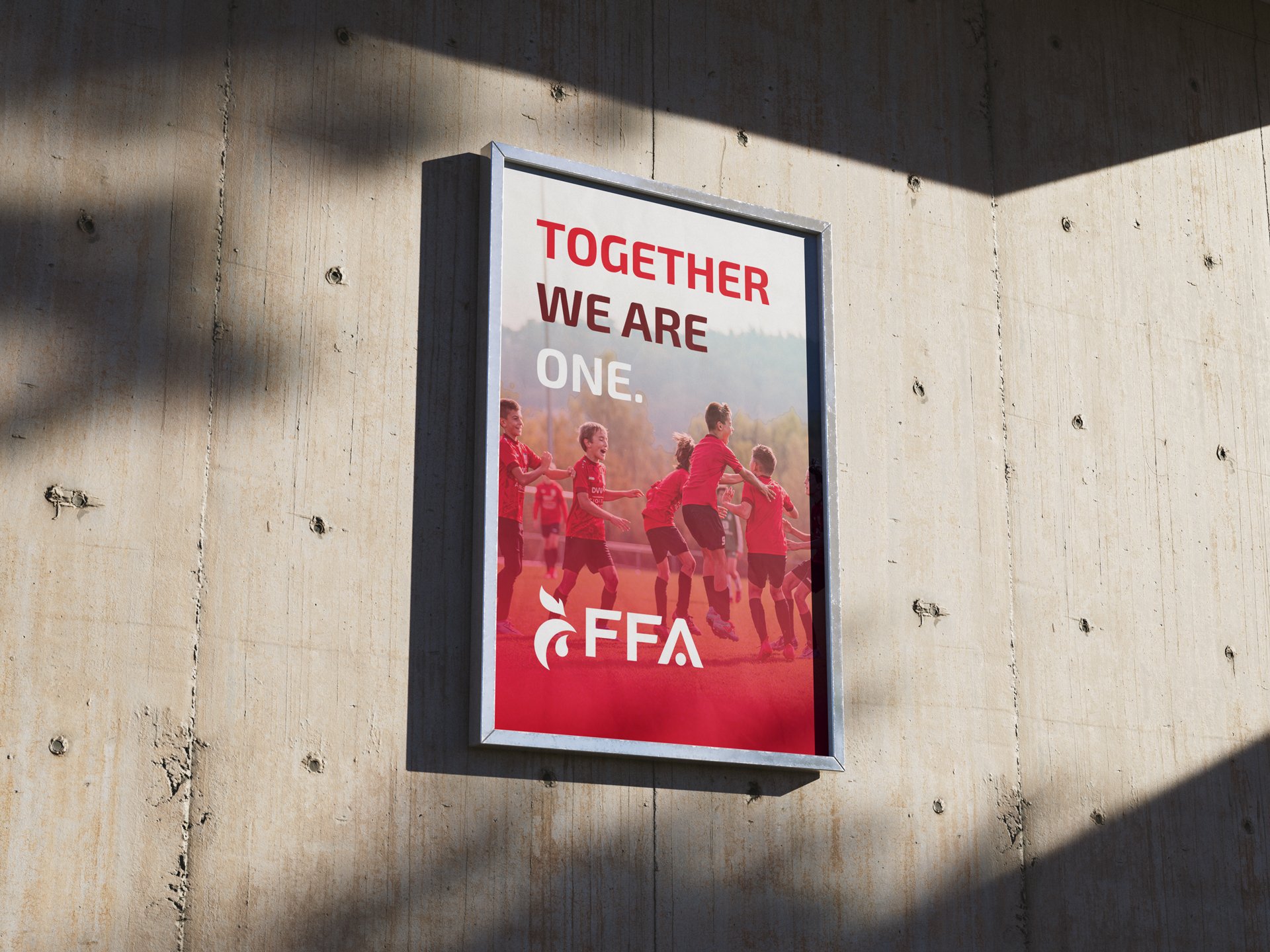
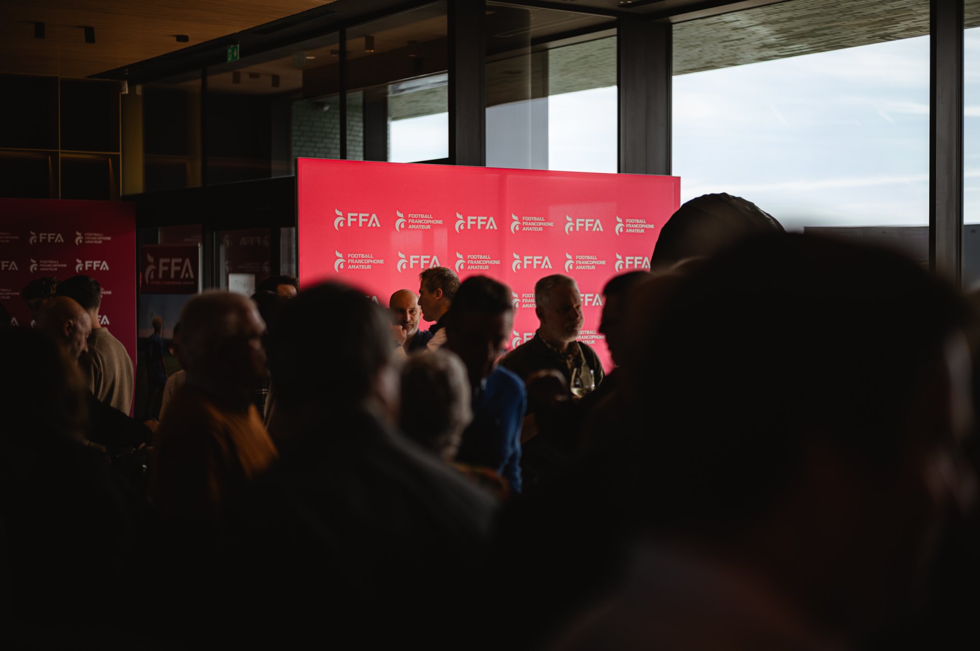
The rebranding was translated into a complete system of applications designed to ensure consistency across the organisation’s communication.
From corporate materials and digital touchpoints to everyday branded assets, the new visual language provides FFA with a clear framework for deploying the identity.
A dedicated brand manual defines the rules required to preserve that coherence over time.
THE RESULT
A new identity for a new chapter
FFA now has a name and visual identity capable of giving francophone amateur football a clearer and stronger presence.
The rebrand creates a more distinctive organisation, a more consistent communication system and a foundation designed to support the brand across its different audiences and applications.
SCOPE
Naming, Rebranding, Brand strategy, Logo design, Visual identity, Brand guidelines, Corporate identity, Brand applications.