Rebranding: evolving without erasing your heritage
Rebranding is often associated with change. A new name, a new logo, new colours, a new visual territory. As if the success of the exercise could be measured by the distance travelled from what came before.
Yet in some projects, the challenge is precisely the opposite: evolving a brand without erasing what has built its recognition.
This was one of the challenges we faced when FTTH Council Europe became Fibre Council Europe.
The name change, decided before our involvement, reflected the evolution of the organisation and its role within the European fibre ecosystem. Our mission was to support this transformation by rethinking its visual identity.
With an additional constraint: less than three weeks to complete the rebranding.
Fibre Council Europe
Rebranding does not necessarily mean starting from scratch
When an organisation decides to evolve its identity, it can be tempting to use the opportunity to change everything.
That is not always the best answer.
FTTH Council Europe already had an established and recognised identity within its sector. Over the years, some of its visual codes had built genuine recognition.
The objective was therefore not to create an artificial break with the past, but to determine what needed to evolve and what was worth preserving.
This distinction is essential in a rebranding process.
An existing identity carries equity. It may reside in a colour, a shape, a typeface, a symbol or simply in the way different elements work together.
Removing everything can sometimes mean unnecessarily giving up part of that accumulated equity.
Evolving perception without losing recognition
The transition to Fibre Council Europe naturally opened a new chapter for the organisation.
Its identity needed to express that evolution.
The visual work therefore involved finding the right balance between continuity and evolution: retaining enough familiar elements for the new brand to remain recognisable within its ecosystem, while giving it a more contemporary, clearer and more flexible expression.
This approach extended across the entire visual system, not just the logo.
Because a brand identity never exists in isolation.
It needs to work on a website, in presentations, across social media, in publications, at events and on institutional communication materials. It must remain identifiable when highly visible, but also when used more subtly.
The real challenge was therefore to create a coherent and sufficiently flexible visual language capable of supporting Fibre Council Europe across all its communications.
Rebranding FCE
Fibre Horizon Rebranding
Three weeks to rethink an identity
Alongside this strategic and creative challenge came a very practical constraint: time.
The new branding had to be developed in less than three weeks.
In this kind of situation, shortening the schedule cannot simply mean removing steps from the process. It requires structuring the thinking very quickly, focusing the exchanges and making decisions at the right moments.
“We completed this rebranding in less than three weeks, with a clear objective: to preserve the continuity of the brand while giving it a visual system capable of supporting its evolution.”
— Olivier P. Creative Director, Creativeroom
Close collaboration with the teams, the availability of everyone involved and the ability to move quickly on key decisions become critical.
Situations like these also highlight the importance of methodology: when time is limited, every decision needs to contribute directly to the result.
Preserving does not mean being conservative
Keeping certain elements of an existing identity does not mean lacking ambition.
Quite the opposite.
One of the most delicate aspects of branding can sometimes be determining what should not be changed.
A relevant rebranding does not necessarily seek to make the before-and-after spectacular. Its first objective is to make the brand more coherent with what it has become and better equipped for what it wants to become.
For Fibre Council Europe, the transformation needed to be visible without creating the impression that a new organisation had replaced the previous one.
The story continued. Its expression evolved.
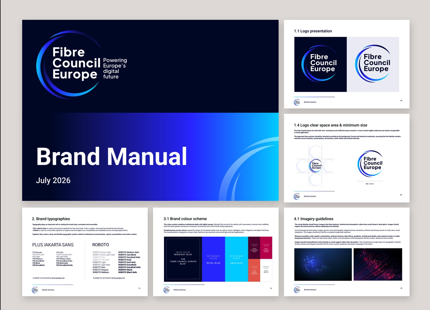
Brandbook Style
Rebranding as an exercise in discernment
Every rebranding ultimately raises a fairly simple question: how much distance should you create from what already exists?
There is no universal answer.
Some brands need a profound break with the past. Others primarily need to regain coherence, modernise their expression or develop a system better suited to their new challenges.
The role of branding is therefore less about changing for the sake of change and more about identifying precisely where transformation creates value.
Fibre Council Europe is a good illustration: an organisation evolving, a new chapter beginning, yet an identity retaining enough of its history to remain immediately recognisable.
Because when it comes to rebranding, evolving a brand does not necessarily mean erasing what built it.
Find out more about Fibre Council Europe
- Fibre Council Europe official website
- Discover Fibre Council Europe's new identity
- Follow Fibre Council Europe on LinkedIn